Components
Every part of the design system, in both themes and under an org’s colour.
Badges
Badges label; status chips report a state: ok, warn and bad for confidence and review, progress for work under way.
Badges
Status
Review wait
Pills
Status lines
Relative dates
Keys
The AI’s mark: hover it, or the button it is in
A brand the run found, where none was picked: in a list’s cell, and beside a name in no brand list
Tooltips
Inverse, after a short delay. An icon button names itself and shows its shortcut: ⌘ on a Mac, Ctrl elsewhere. These three work.
Icon buttons
Sides
Fields
36 px fields; focus draws the ring. An invalid field says why under it, linked to the field.
Text
Shown in lists and reports.
Invalid
Enter an email address, like name@company.com.
Disabled
Search
One-time code
The 6 digits from the email, checked as soon as you enter the last one.
A wrong code
That code doesn’t work. Check the latest email, or send a new code.
A long value
Text area
Choices
Select, checkbox, switch and radio, all by keyboard. Checked controls take the primary colour.
Select
Checkboxes
Switch
Radio group
Form
zod validates and next-intl words the messages. The label, the hint and the message are linked to the control. Send it empty.
Tabs
Tabs switch panels; the segmented control picks one value. One thumb slides to the choice.
Tabs
Segmented control
With counts
A tab with none: dimmed, still chosen by a click
Cards
Flat: a border, no shadow. A card that opens something lifts a little on hover.
Stats cards: a line of weekly averages, or a bar a week
Stopping power8 weeks
75 of 100+4 on last quarter
Conversion8 weeks
49 of 100-1 on last quarter
ScoredThis quarter
3628 released
Most often at 2★ or lessof 8 released
- Visual simplicity3
- Shopper message2
- Product exposure1
Usage chart: credits solid and re-scores soft, a bar a day, today darker and the days to come marked; a group’s share of the credits
Day by day
Credits spent and re-scores, in UTC.
| Day | Credits | Re-scores |
|---|---|---|
| Sun 1 Nov | 2 | 0 |
| Mon 2 Nov | 0 | 0 |
| Tue 3 Nov | 5 | 1 |
| Wed 4 Nov | 3 | 2 |
| Thu 5 Nov | 7 | 0 |
| Fri 6 Nov | 1 | 1 |
| Sat 7 Nov (today) | 4 | 0 |
By team
Credits
Left this month
42
Visuals
Scored this month
14
Headlines
What every analysis leads with
Settings card
Each setting on a row: what it is on the left, its value or control on the right; one column on a narrow panel
Expected improvement
Shows how much a move should lift its score
Visual id prefix
Every visual id of the organisation starts with it
Data table
Search, filters with counts, sorting and pages; the pager for a list the server pages. Type names and headline labels come from the engine’s contracts.
The list toolbar over a wide table: pinned first column and open arrow, rows as links (j, k, Enter), the Columns menu
A table with its own search and filters
Summer on the peaksALP-2026-00142 | Poster / digital poster | Released | 64 out of 100 | 38 out of 100 | 18 Oct |
Summer on the peaks · master creativeALP-2026-00140 | Key visual / master creative | Released | 74 out of 100 | 46 out of 100 | 16 Oct |
Summer on the peaks · web bannerALP-2026-00145 | E-commerce static ad / banner | Released | 80 out of 100 | 22 out of 100 | 18 Oct |
Greenleaf oat baristaGRN-2026-00019 | Wobbler / shelf talker | Scoring | No score | No score | 21 Oct |
Cruncho extra crunchCRN-2026-00087 | Shelf-ready packaging (SRP) | Released | 78 out of 100 | 66 out of 100 | 17 Oct |
Cruncho red chilli packCRN-2026-00090 | Primary packaging | Released | 80 out of 100 | 64 out of 100 | 17 Oct |
Velour 2 for 4,99VEL-2026-00031 | Standard product display (FSD) | In review | No score | No score | 21 Oct |
Velour dark, spring waveVEL-2026-00029 | Standard product display (FSD) | Released | 84 out of 100 | 78 out of 100 | 15 Oct |
Cruncho classic, autumnCRN-2026-00085 | Shelf-ready packaging (SRP) | Released | 52 out of 100 | 36 out of 100 | 12 Oct |
Mountain water, aisle finALP-2026-00133 | Aisle fin | Released | 58 out of 100 | 41 out of 100 | 9 Oct |
Pager, for a list the server pages
States
A list says when it is empty, shows its shape while it loads, and offers a retry when it fails.
Empty
No visuals yet
Score your first visual and it will show here.
Error
Something went wrong
The visuals could not be loaded. Try again; if it keeps happening, let us know.
Loading a list
Loading a card
Loading
Dialogs
Focus moves in and stays there; Escape closes and focus returns. Only overlays cast a shadow.
Dialog, alert dialog, sheet
Confirm, waiting for its action: one succeeds, one is refused
Toasts
Bottom right, announced to screen readers. A success check draws itself.
Kinds
Command palette
⌘K opens search and commands anywhere. Arrow keys move, Enter opens.
The shell’s palette
In a popover, as a picker
App shell
⌘B folds the sidebar, ⌘J opens the agent. Under 900 px the sidebar is a sheet and the agent covers the page.
Live state
Breadcrumbs
Avatars
Sidebar items
Staff’s scope: all organisations, the internal one, each client’s
Scroll area
Brand
A white-labelled org sees its colour on fills, rings and selected controls, its logo in the switcher, and “Powered by Shopnosis” at the sidebar’s foot (D74). The logo on its PDFs is every org’s (D81). Its admin sees what the colour becomes in each theme before saving it; the body takes it too, for what opens over the page.
Shopnosis
Org tiles in the app: a white-labelled org’s logo, else initials
 Cruncho SnacksVelour Confectionery
Logo slot: the org’s, else Shopnosis’s
An org’s colour on a subtree
Always the colour of Cruncho Snacks, whatever the switch above says: buttons, checked controls and the focus ring change; text stays the foreground.
An admin’s colour in each theme: the white-labelled org’s, one taken as given, one moved in both
- App, light theme and PDFs · #c8352b4.8 : 1 on the page, needs 3 · 5.0 : 1 for a label, needs 4.5As given
- App, dark theme · #c7342a3.2 : 1 on the page, needs 3 · 4.5 : 1 for a label, needs 4.5Darkened
#c8352b would be hard to read there, so Shopnosis uses a darker shade in the dark theme. Scores stay blue; your logo keeps its own colours.
- App, light theme and PDFs · #0f766e5.0 : 1 on the page, needs 3 · 5.2 : 1 for a label, needs 4.5As given
- App, dark theme · #0f766e3.1 : 1 on the page, needs 3 · 4.7 : 1 for a label, needs 4.5As given
- App, light theme and PDFs · #d823754.4 : 1 on the page, needs 3 · 4.6 : 1 for a label, needs 4.5Darkened
- App, dark theme · #e634804.2 : 1 on the page, needs 3 · 4.5 : 1 for a label, needs 4.5Lightened
#db2777 would be hard to read there, so Shopnosis uses a darker shade in the light theme and a lighter one in the dark theme. Scores stay blue; your logo keeps its own colours.
A value to copy into an identity provider
https://app.shopnosis.example/api/auth/sso/callback/sso-org_crunchoAdd it to the app you registered for Shopnosis.
Its label hidden, a link opened from the field beside Copy (the settings’ sign-in address)
https://app.shopnosis.example/api/auth/sso/callback/sso-org_crunchoOpen itThe top of a PDF page, as the branding settings preview it: the white-labelled org’s, and one with neither logo nor colour
Signed-out pages
Sign in by a code or its link, by a passkey, an invitation and sign-up: the logo above one card on the grey frame, a note under it. After a code, a device that can hold a passkey is offered one, until it adds one or 30 days after “Not now”; the account page lists them, renamed in a dialog and removed once confirmed. A form’s problem is an alert inside the card, announced at once; a page that failed is an error state.
A sign-in page
Sign in to Shopnosis
Use your work email.
Your organisation may sign you in through its own sign-in.
A state
Check your email
We’ve sent sara@alpina.example a link to set up your account and your organisation.
The link works for a day.
Alerts
The code step
Check your email
If sara@alpina.example has a Shopnosis account, we’ve sent it an email to sign in with. Enter the code from it, or open its link.
The link’s page
Sign in to Shopnosis
Signing you in…
The offer after a code
Use Face ID or Touch ID next time
Add a passkey to sign in with Face ID or Touch ID on this device, without waiting for a code.
You can remove it from your account at any time.
A link that no longer works
This link no longer works
It was used already, it ran out, or a newer email replaced it. Send a new code to sign in.
A person’s passkeys
Passkeys
Sign in with your face, fingerprint or screen lock instead of an emailed code.
- Chrome on MacAdded 14 Sept 2026
- Sara’s iPhoneAdded 2 Oct 2026
No passkeys, and none to add
Passkeys
Alpina Beverages signs you in through its own SSO, so there’s no passkey to add.
No passkeys yet
Made-up analyses in the engine’s shape, on the prototype’s sample pictures.
Report
A report from one analysis: the picture with its zones beside the headlines, the concepts, the next moves and the strengths and weaknesses. Hover or focus a concept to light its evidence; choose a zone to pin it. A visual in review shows the client no scores (D71); confidence is staff only (D72).
Summer on the peaks
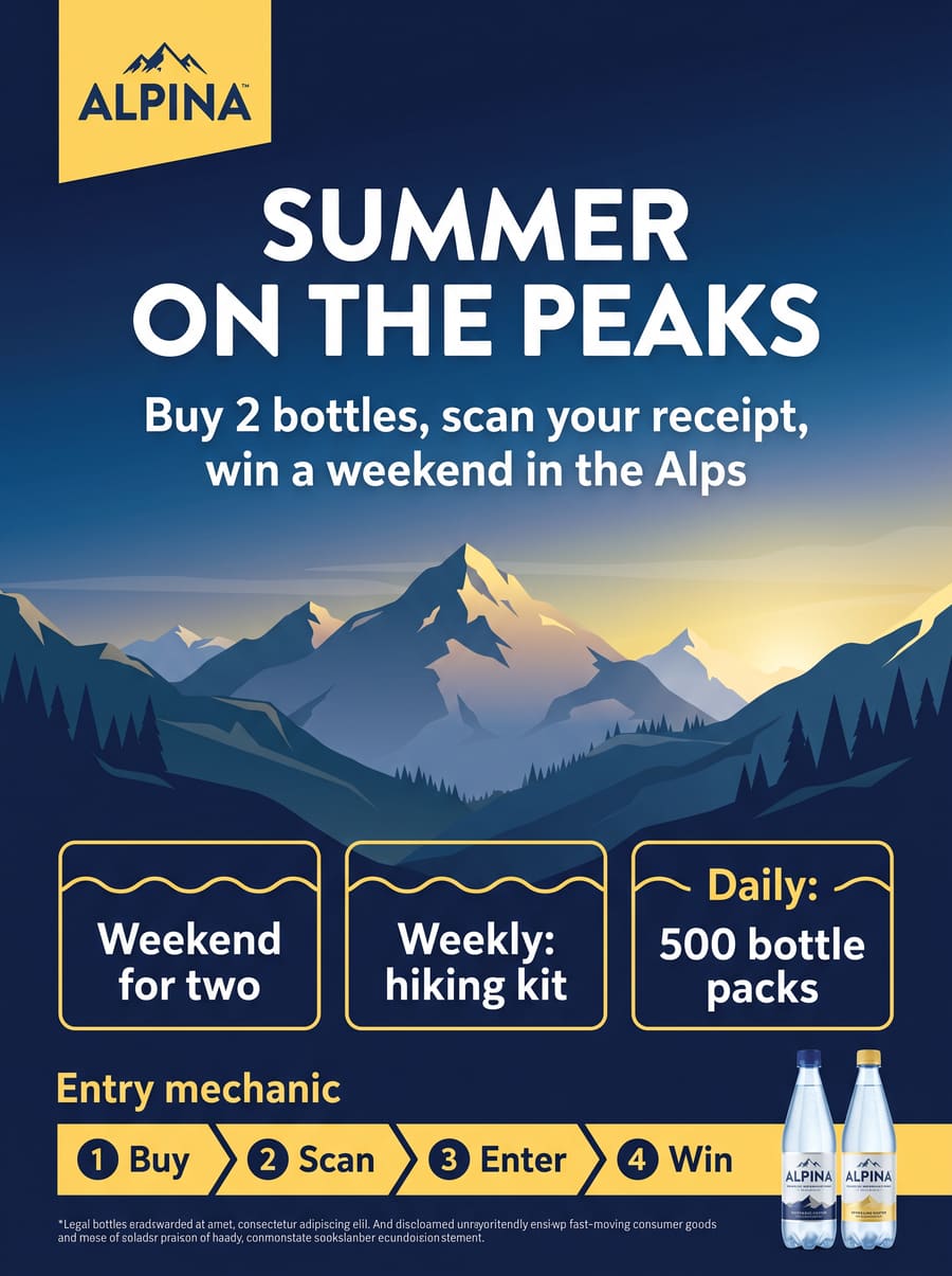
Conversion holds it back, at 38.
Communication
- Logo sizeThe logo covers 6% of the poster.Measured75 out of 100
- Logo legibilityThe logo reads first, top left, in its yellow badge.Judged75 out of 100
- Brand colours appliedDeep blue and yellow carry the brand across the poster.Judged75 out of 100
- Typography on brandThe headline's rounded letters match the logo.Judged75 out of 100
- Tone on brandCheerful and outdoorsy, like the brand.Judged75 out of 100
- Imagery on brandThe mountain scene suits the brand, but the prize panel breaks it up.Judged50 out of 100
FixLet the mountain scene run unbroken behind one prize panel.
- Message sizeThe headline covers 18% of the poster.Measured75 out of 100
- Font sizeSet large enough to read from about 4 m.Measured75 out of 100
- ContrastWhite on deep blue reads cleanly.Judged75 out of 100
- BrevityNine words.Measured75 out of 100
- ReadabilityOne clear line and a short promise.Judged75 out of 100
- Reason or benefitIt promises a weekend in the Alps.Judged75 out of 100
- Action wordingIt names the prize but not what to do to win it.Judged50 out of 100
- Emotional appealSummer and mountains make the prize feel close.Judged75 out of 100
- PositionTop centre, read straight after the logo.Judged75 out of 100
- Fits the designSet in the poster's own type and colours.Judged75 out of 100
- Messages work togetherone shopper messageJudgedn/a
FixLift the entry line up to the headline.
- CoverageThe scene covers 38% of the poster.Measured75 out of 100
- Emotional appealA sunny alpine valley sets a summer mood.Judged75 out of 100
- DistinctivenessA familiar alpine scene.Judged50 out of 100
- Brand fitThe mood fits mountain water, but no bottle stands in the scene.Judged50 out of 100
- One storyThe scene and the three prize boxes tell two stories.Judged25 out of 100
FixLet the mountain scene run behind the bottles and keep the prize boxes off it.
- Text to imageryText covers 31% of the poster, close to the imagery's share.Measured25 out of 100
- Word count46 words, on a prize game's scale.Measured50 out of 100
- Reading orderFour blocks of copy fight for the lower half.Judged25 out of 100
FixFold the prize panel and the entry steps into one line of mechanics.
- FocusFive elements compete for the first look.Judged25 out of 100
- No clutter18 design elements crowd the layout.Judged0 out of 100
- Hierarchy strengthThe headline is clear; everything below it is flat.Judged25 out of 100
- Focused paletteFive main colours.Measured75 out of 100
- Useful empty space14% of the poster is free space.Measured25 out of 100
FixRemove three of the five lower blocks.
Product presentation
- Product sizeThe bottles cover about 2% of the poster.Measured10 out of 100
- IdentifiableFrom 2 m the label is too small to read.Judged25 out of 100
- PositionBottom right corner, the last place the eye reaches.Judged25 out of 100
- LightingEvenly lit, but small against the dark sky.Judged50 out of 100
- Not coveredNothing covers the bottles.Judged75 out of 100
- Product name readableThe product name can't be read at this size.Judged25 out of 100
- Features highlightedThe copy sells the prizes, not the water.Judged25 out of 100
FixMake the bottles a third of the poster's height, beside the headline.
Presence
- Colour contrastDeep blue and yellow break from a typical drinks aisle.Judged75 out of 100
- ShapeA plain rectangle.Judged50 out of 100
FixAdd one bright accent beside the product.
- Looks premiumA consistent, clean illustration.Judged75 out of 100
- Print and finishThe crowded lower half looks cheaper than the scene above it.Judged50 out of 100
- Category fitReads as an outdoor water brand.Judged75 out of 100
FixGive the scene and the headline more room.
Engine 0.0.0 · calibration 2026-10-18 · 4 min 12 s
Zone editor
What “Adjust zones” opens on a released visual (D325–D327): move, resize, add or delete any of the nine zone types, and change a text zone’s text. By pointer or keyboard: on a zone, the arrow keys move it, with Shift they resize it, and Delete removes it. The re-score is confirmed with what it changes; the server puts the zones back into the annotation, and the worker derives the rest before it scores. A visual has three adjustments by default (D326).
Drag a zone to move it, or the chosen zone’s corners to resize it. On a zone, the arrow keys move it, Shift and an arrow key resize it, and Delete removes it.
Zones
7 zonesChoose a zone on the picture or in the list to change it.
Move, resize, add or delete a zone, or change a text, to re-score. This visual can be adjusted 3 more times.
Score meters
Score data is cobalt and only cobalt, under any org theme (D70, D74): five segments, one per 20 points, filled one after another. The benchmark places a headline in its pool; the ring counts a run up.
By value
Small, and not applicable
Benchmark
Progress ring
Review and confidence
A visual Shopnosis has not released. The client reads first that it needs a more in-depth analysis, then why in plain words, with no values and no promised time (D71). Staff read its confidence: high, medium or low in the state colours, always beside the word.
In review: the type
This visual needs a more in-depth analysis
We’re giving it a closer look, so it takes a little longer than usual. We’ll email Sara when the scores are ready.
We want to be sure what kind of material this is, because every score depends on it.
Choosing it re-scores the visual for free. If nothing else needs a look, it’s released straight away.
In review: an input
This visual needs a more in-depth analysis
We’re giving it a closer look, so it takes a little longer than usual. We’ll email Mila when the scores are ready.
Part of the visual needs a closer reading, so that every score rests on all of it.
Rejected
Not scored
Shopnosis couldn’t score this photo and refunded your credit.
The photo shows the tray from too far away to read its front. Take it again from about a metre and we’ll score it.
Not scored: no marketing material
Not scored
Shopnosis couldn’t score this photo and refunded your credit.
We couldn’t find a pack, tray, display or sign to score in this photo. Try one focused on the material you want to test: store clutter around it is fine.
Status
Confidence of this analysis
Confidence is staff only: choose Shopnosis staff above to see it.
Warnings and disputed values of this analysis
Confidence is staff only: choose Shopnosis staff above to see it.
Type at upload
The type is required and there is no “detect” (D73): a fast model suggests one in a moment, marked with a sparkle, to keep or change. Every type is in the list, by channel.
Add an image and we’ll suggest the type, the goal and the category in a moment. Or choose a type now.
The picks, from lists: jev’s likeliest as badges, a name a list lacks added
Choices as cards: who can see a visual
A picture jev finds no material in, and “Score it anyway”
This doesn’t look like a pack, tray, display or sign
The picture: drop, choose or paste one
- Master creative
- In-store POS
- In-store displays
- Packaging
- E-commerce
A shelf photo and other angles, as each uploads
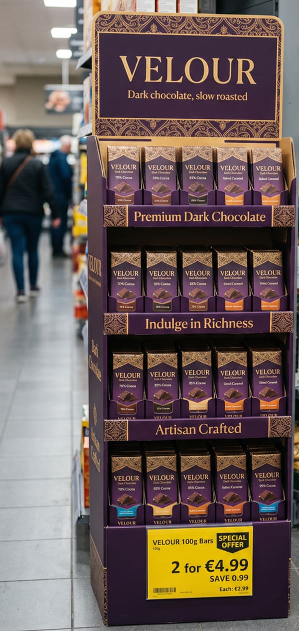 display.jpg: Ready
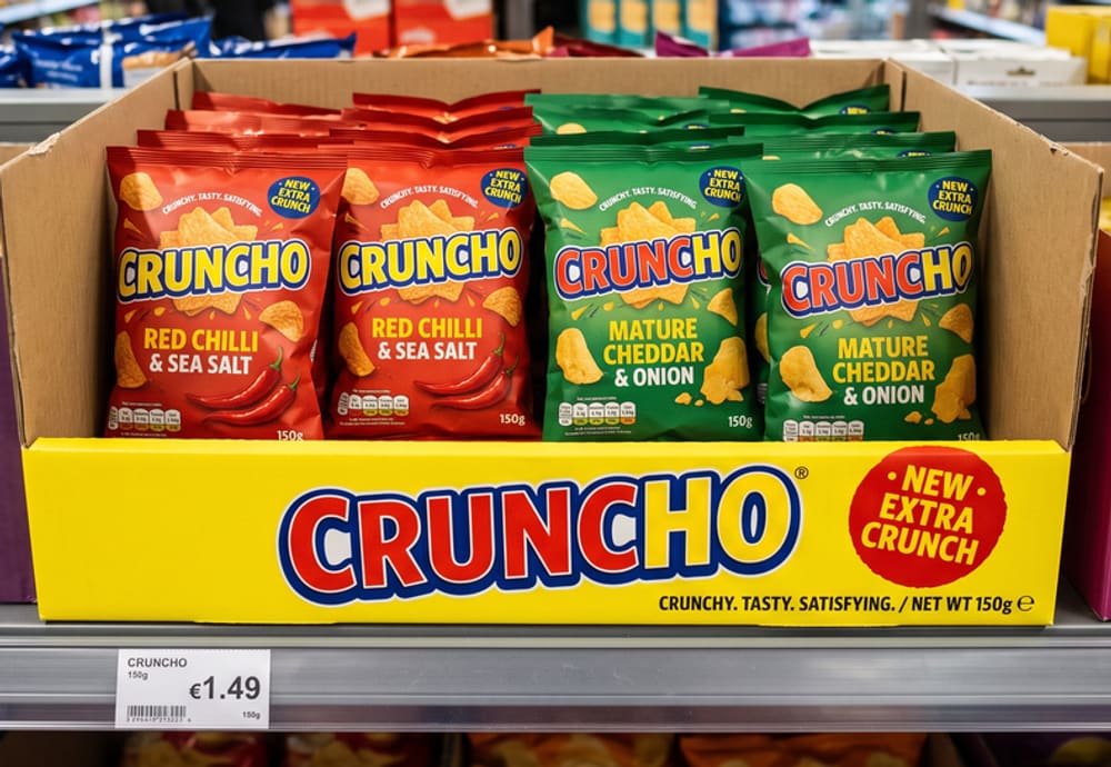 tray.jpg: Uploading
- poster.jpg: Not uploaded
Run progress
A run while it runs, from the engine’s progress events: each stage done, current or to come, and the time a stage took. The current stage is announced politely. A run waits in the queue first and may be cancelled. Staff also see the last workers finished and what the run has cost so far; a client never does (D72).
You can leave this page: it carries on, and the scores will be here.
- Logo1 zone
- Key visual1 zone
- Promotion1 zone
- Product1 zone
- Other text2 zones
- Type
- Poster / digital poster
- Brand
- Alpina
- Category
- Water & soft drinks
- Zones
- 7
Stopping power, Conversion and the next moves are in the report.
No worker has finished yet.
Re-scoring with adjusted zones
This report stays until the new scores are ready.
Re-scoring as Wobbler / shelf talker
This report stays until the new scores are ready.
Re-scoring with adjusted zones
This report stays until the new scores are ready.
- preflight2.1 sUS$0.0021
- annotator/workers/brand-logo4 sUS$0.006
- annotator/workers/message4.9 sUS$0.007
- annotator/workers/key-visual5.8 sUS$0.008
- annotator/workers/promotionFailed
- annotator/workers/product7.6 sUS$0.01
Compare
2–6 released visuals side by side, a column each: the picture, Stopping power and Conversion, the benchmark position once PLAN_08 serves one, every concept the visuals’ types score aligned row by row, and each visual’s first moves. A concept a type does not score reads n/a and one it does not show reads “Not shown”; the highest of a row whose values are further apart than a re-run’s spread is highlighted and named (D368, D369). Visuals of more than one channel are warned about. Printed, it is the compare’s PDF in the report’s two formats and frame (D370, D371). It is the client’s: no confidence, no Overall.
On screen
Different channels: In-store POS, In-store displays and PackagingTheir concepts and weights differ. A concept a type doesn’t score shows n/a.
A highlighted score is the highest in its row. Scores within 5 points on a headline or 10 on a concept could swap if the same visuals were scored again.
| | | ||
|---|---|---|---|---|
| Headline scores | ||||
| Stopping powerWhether shoppers notice it. | 64 out of 100 | 84 out of 100, the highest in this row | 78 out of 100 | 79 out of 100 |
| ConversionHow effectively does this creative encourage purchase? | 38 out of 100 | 78 out of 100, the highest in this row | 66 out of 100 | 64 out of 100 |
| Communication | ||||
| Branding | 74 out of 100 | 88 out of 100, the highest in this row | 82 out of 100 | 86 out of 100 |
| Shopper message | 71 out of 100 | 76 out of 100, the highest in this row | 64 out of 100 | 66 out of 100 |
| Key visual | 57 out of 100 | Not applicable | Not applicable | 78 out of 100, the highest in this row |
| Text balance | 34 out of 100 | 82 out of 100, the highest in this row | Not applicable | 72 out of 100 |
| Visual simplicity | 16 out of 100 | 72 out of 100, the highest in this row | Not applicable | 58 out of 100 |
| Price promotion | Not applicable | 84 out of 100 | Not applicable | Not applicable |
| Product presentation | ||||
| Product exposure | 22 out of 100 | 80 out of 100, the highest in this row | Not applicable | Not applicable |
| Product order | Not applicable | 74 out of 100 | 75 out of 100, the highest in this row | Not applicable |
| Pack visibility | Not applicable | Not applicable | 70 out of 100 | Not applicable |
| Presence | ||||
| Visual contrast | 68 out of 100 | Scored but not shown on this material | 86 out of 100, the highest in this row | 72 out of 100 |
| Premium feel | 65 out of 100 | 90 out of 100, the highest in this row | Not applicable | 54 out of 100 |
| Creativity | Not applicable | Not applicable | 61 out of 100 | Not applicable |
| Next moves | ||||
| First moves |
|
|
|
|
Summary
Asked for by Sara Kovač · 12 Nov 2026
The Alpina poster stops shoppers best of the four; the Velour display and the Cruncho tray convert better than they stop, and the pack trails on both.
Alpina | Poster
Its logo and packshot read at a glance and the photograph carries the summer theme, so it leads on Stopping power. Its message is short but sits low, under the fold of the frame.
Velour display and Cruncho tray
Both hold their products in order and show them well, which lifts Conversion, but neither stands out from a busy aisle: the display’s header is pale and the tray’s front panel repeats the pack.
Cruncho | Pack
The pack names its variant clearly but its brand block is small for the shelf, and there is no claim to give a reason to pick it up.
Recommendation
Take the poster’s photograph and message into the display’s header, and give the tray a front panel of its own with the brand larger than the packs behind it.
Written by the agent from these scores and pictures. Check it against the table.
Printed
 Alpina Beverages
Powered by
Comparison
Four visuals compared
- Date scored
- 15 – 18 Oct 2026
- Channels
- In-store POS, In-store displays and Packaging
- Summary written
- 12 Nov 2026
- ALP-2026-00142AlpinaPoster / digital poster · In-store POS
- VEL-2026-00029VelourStandard product display (FSD) · In-store displays
- CRN-2026-00087CrunchoShelf-ready packaging (SRP) · Packaging
- CRN-2026-00090CrunchoPrimary packaging · Packaging
Comparison
Summary
The Alpina poster stops shoppers best of the four; the Velour display and the Cruncho tray convert better than they stop, and the pack trails on both.
Alpina | Poster
- Alpina · ALP-2026-00142
Its logo and packshot read at a glance and the photograph carries the summer theme, so it leads on Stopping power. Its message is short but sits low, under the fold of the frame.
Velour display and Cruncho tray
- Velour · VEL-2026-00029
- Cruncho · CRN-2026-00087
Both hold their products in order and show them well, which lifts Conversion, but neither stands out from a busy aisle: the display’s header is pale and the tray’s front panel repeats the pack.
Cruncho | Pack
- Cruncho · CRN-2026-00090
The pack names its variant clearly but its brand block is small for the shelf, and there is no claim to give a reason to pick it up.
Recommendation
Take the poster’s photograph and message into the display’s header, and give the tray a front panel of its own with the brand larger than the packs behind it.
Written by the agent from these scores and pictures on 12 Nov 2026.
Alpina BeveragesFour visuals compared15 – 18 Oct 2026Powered by
Scores
Scores side by side
Different channels: In-store POS, In-store displays and PackagingTheir concepts and weights differ. A concept a type doesn’t score shows n/a.
A highlighted score is the highest in its row. Scores within 5 points on a headline or 10 on a concept could swap if the same visuals were scored again.
ALP-2026-00142Poster / digital poster | VEL-2026-00029Standard product display (FSD) | CRN-2026-00087Shelf-ready packaging (SRP) | CRN-2026-00090Primary packaging | |
|---|---|---|---|---|
| Headline scores | ||||
| Stopping power | 64 out of 100 | 84 out of 100, the highest in this row | 78 out of 100 | 79 out of 100 |
| Conversion | 38 out of 100 | 78 out of 100, the highest in this row | 66 out of 100 | 64 out of 100 |
Alpina BeveragesFour visuals compared15 – 18 Oct 2026Powered by
Scores, continued
ALP-2026-00142Poster / digital poster | VEL-2026-00029Standard product display (FSD) | CRN-2026-00087Shelf-ready packaging (SRP) | CRN-2026-00090Primary packaging | |
|---|---|---|---|---|
| Communication | ||||
| Branding | 74 out of 100 | 88 out of 100, the highest in this row | 82 out of 100 | 86 out of 100 |
| Shopper message | 71 out of 100 | 76 out of 100, the highest in this row | 64 out of 100 | 66 out of 100 |
| Key visual | 57 out of 100 | Not applicable | Not applicable | 78 out of 100, the highest in this row |
| Text balance | 34 out of 100 | 82 out of 100, the highest in this row | Not applicable | 72 out of 100 |
| Visual simplicity | 16 out of 100 | 72 out of 100, the highest in this row | Not applicable | 58 out of 100 |
| Price promotion | Not applicable | 84 out of 100 | Not applicable | Not applicable |
| Product presentation | ||||
| Product exposure | 22 out of 100 | 80 out of 100, the highest in this row | Not applicable | Not applicable |
| Product order | Not applicable | 74 out of 100 | 75 out of 100, the highest in this row | Not applicable |
| Pack visibility | Not applicable | Not applicable | 70 out of 100 | Not applicable |
| Presence | ||||
| Visual contrast | 68 out of 100 | Scored but not shown on this material | 86 out of 100, the highest in this row | 72 out of 100 |
| Premium feel | 65 out of 100 | 90 out of 100, the highest in this row | Not applicable | 54 out of 100 |
| Creativity | Not applicable | Not applicable | 61 out of 100 | Not applicable |
Alpina BeveragesFour visuals compared15 – 18 Oct 2026Powered by
Next moves
Each visual’s first moves
ALP-2026-00142Poster / digital poster | VEL-2026-00029Standard product display (FSD) | CRN-2026-00087Shelf-ready packaging (SRP) | CRN-2026-00090Primary packaging | |
|---|---|---|---|---|
| First moves |
|
|
|
|
Alpina BeveragesFour visuals compared15 – 18 Oct 2026Powered by
About
Shopnosis
Shopnosis revolutionises retail marketing planning for leading CPG brands, optimising in-store campaigns through real shopper insights.
It learns from more than 10 million real shopping interactions, captured with smart glasses, and has measured how well more than 10,000 in-store campaigns attract and convert shoppers. It is the only AI trained solely on real in-store data, so its results predict how in-store marketing performs.
Learns from
- More than 10,000 in-store campaigns
- Real shopping trips on three continents
- Leading global retailers
What the scores mean
- Stopping power
- Whether shoppers notice it.
- Conversion
- How effectively does this creative encourage purchase?
Every score is out of 100. Its five stars are bands of 20 points, and the meter fills one segment a band.
- 5 stars80 and above
- 4 stars60–79
- 3 stars40–59
- 2 stars20–39
- 1 starUnder 20
Next moves
One move for every score under 80, weakest score first.
Engine 0.0.0 · calibration 2026-10-18
Alpina BeveragesFour visuals compared15 – 18 Oct 2026Powered by
Your AI assistant for retail marketing planning
Designer
AI concepts of a visual (PLAN_15): its picture redesigned with the moves a member picks, the products kept as they are. The report tab’s gallery, each tile opening the concept’s own page; a concept while it is made; the concept beside its original, side by side or on a slider; the moves it applies, ticked or not come through; and the dialog’s moves, weakest first, the first three ticked (D550, D559, D560).
The AI concepts tab’s gallery
While a concept is made
Designing your AI concept
Your picture is being redesigned with the moves you chose. You can leave this page: the concept will be here when it is ready.
Usually 1 to 2 minutes
A concept beside its original
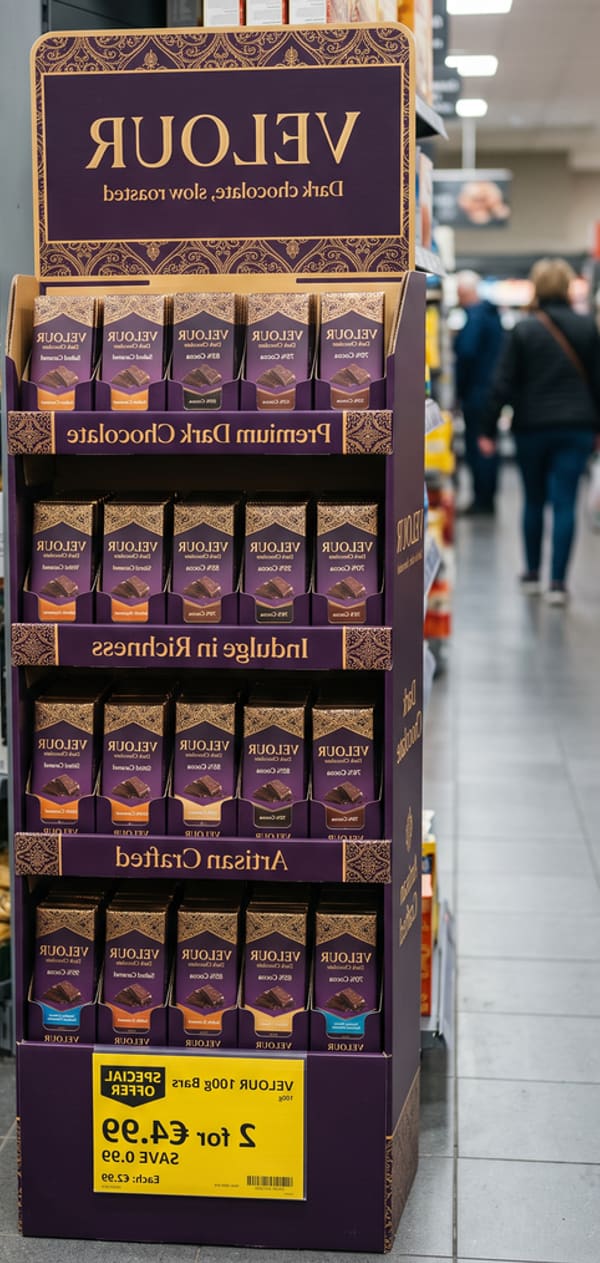
Before and after
The moves it applies
- Visual simplicitycame throughCut the lower half to one prize panel and one line of mechanics.
- Product exposurecame throughMake the bottles a hero: a third of the poster's height, beside the headline.
- Text balancedidn’t come throughTurn the entry steps into one line under the headline.
The dialog’s moves
Print variants
The report as PLAN_09’s PDF route prints it: A4 portrait or 16:9 slides, light whatever the theme, still, every concept open. Every org’s logo heads every page, with “Powered by Shopnosis” at the foot; without one, Shopnosis’s logo heads them. Only a white-labelled org’s colour prints (D74, D81). It is the client’s: no confidence, no Overall, and a visual in review prints only that it is (D71). Open one at print size to print it to PDF.
Alpina BeveragesPowered by
Report
Summer on the peaks
- Date scored
- 18 Oct 2026
- Material type
- Poster / digital poster
- Goal
- Prize game
- Brand
- Alpina
- Category
- Water & soft drinks
- Visual id
- ALP-2026-00142
Results
Summer on the peaks
- Logo
- Key visual
- Promotion
- Product
- Other text
Scores by area
Communication
- Branding74 out of 100
- Shopper messagePreviously Call to action71 out of 100
- Key visual57 out of 100
- Text balance34 out of 100
- Visual simplicity16 out of 100
- Price promotionn/a
Product presentation
- Product exposure22 out of 100
Presence
- Visual contrast68 out of 100
- Premium feelPreviously Shopping experience65 out of 100
Alpina BeveragesSummer on the peaksALP-2026-00142 · 18 Oct 2026Powered by
Next moves
What to change first
One move for every score under 80, weakest score first.
01 · Visual simplicityScores 16 out of 100
Cut the lower half to one prize panel and one line of mechanics.
Lead with the weekend for two; fold the weekly and daily prizes into a single line beneath it.
02 · Product exposureScores 22 out of 100
Make the bottles a hero: a third of the poster's height, beside the headline.
Move both 1.5 L bottles out of the corner to the right of the headline, and keep the yellow caps clear of the dark sky so they read from the end of the aisle.
03 · Text balanceScores 34 out of 100
Turn the entry steps into one line under the headline.
For example: “Buy 2 bottles · scan your receipt · win a weekend in the Alps”. Keep the legal line at the bottom as it is.
04 · Key visualScores 57 out of 100
Let the mountain scene run behind the bottles.
Take the three prize boxes off the valley so the scene reads as one picture, with the bottles standing in it.
05 · Premium feelScores 65 out of 100
Give the scene and the headline more room.
With one prize panel instead of three, the illustration can breathe; keep the restrained blue and yellow.
06 · Visual contrastScores 68 out of 100
Add one bright accent beside the product.
The dark sky already breaks from the drinks aisle. A yellow band behind the bottles pulls the eye down to them from a distance.
07 · Shopper messageScores 71 out of 100
Lift the entry line up to the headline.
“Buy 2 bottles, scan your receipt” is clear but sits apart from the prize promise; set it directly under the headline, a size larger.
08 · BrandingScores 74 out of 100
Give the logo a little more clear space.
The yellow corner badge nearly touches the headline; a little clear space lets it read first from further away.
Alpina BeveragesSummer on the peaksALP-2026-00142 · 18 Oct 2026Powered by
Appendix
What each score rests on
The sub-scores behind each score: measured on the zones, or judged against written anchors.
Branding74 out of 100
The mountain scene suits the brand, but the prize panel breaks it up.| Logo size | Measured | 75 out of 100 |
|---|---|---|
| Logo legibility | Judged | 75 out of 100 |
| Brand colours applied | Judged | 75 out of 100 |
| Typography on brand | Judged | 75 out of 100 |
| Tone on brand | Judged | 75 out of 100 |
| Imagery on brand | Judged | 50 out of 100 |
Shopper message71 out of 100
Previously Call to action
It names the prize but not what to do to win it.| Message size | Measured | 75 out of 100 |
|---|---|---|
| Font size | Measured | 75 out of 100 |
| Contrast | Judged | 75 out of 100 |
| Brevity | Measured | 75 out of 100 |
| Readability | Judged | 75 out of 100 |
| Reason or benefit | Judged | 75 out of 100 |
| Action wording | Judged | 50 out of 100 |
| Emotional appeal | Judged | 75 out of 100 |
| Position | Judged | 75 out of 100 |
| Fits the design | Judged | 75 out of 100 |
| Messages work together | Judged | n/a |
Key visual57 out of 100
The scene and the three prize boxes tell two stories.| Coverage | Measured | 75 out of 100 |
|---|---|---|
| Emotional appeal | Judged | 75 out of 100 |
| Distinctiveness | Judged | 50 out of 100 |
| Brand fit | Judged | 50 out of 100 |
| One story | Judged | 25 out of 100 |
Text balance34 out of 100
Text covers 31% of the poster, close to the imagery's share.| Text to imagery | Measured | 25 out of 100 |
|---|---|---|
| Word count | Measured | 50 out of 100 |
| Reading order | Judged | 25 out of 100 |
Visual simplicity16 out of 100
18 design elements crowd the layout.| Focus | Judged | 25 out of 100 |
|---|---|---|
| No clutter | Judged | 0 out of 100 |
| Hierarchy strength | Judged | 25 out of 100 |
| Focused palette | Measured | 75 out of 100 |
| Useful empty space | Measured | 25 out of 100 |
Alpina BeveragesSummer on the peaksALP-2026-00142 · 18 Oct 2026Powered by
Appendix, continued
Product exposure22 out of 100
The bottles cover about 2% of the poster.| Product size | Measured | 10 out of 100 |
|---|---|---|
| Identifiable | Judged | 25 out of 100 |
| Position | Judged | 25 out of 100 |
| Lighting | Judged | 50 out of 100 |
| Not covered | Judged | 75 out of 100 |
| Product name readable | Judged | 25 out of 100 |
| Features highlighted | Judged | 25 out of 100 |
Visual contrast68 out of 100
A plain rectangle.| Colour contrast | Judged | 75 out of 100 |
|---|---|---|
| Shape | Judged | 50 out of 100 |
Premium feel65 out of 100
Previously Shopping experience
The crowded lower half looks cheaper than the scene above it.| Looks premium | Judged | 75 out of 100 |
|---|---|---|
| Print and finish | Judged | 50 out of 100 |
| Category fit | Judged | 75 out of 100 |
Alpina BeveragesSummer on the peaksALP-2026-00142 · 18 Oct 2026Powered by
About
Shopnosis
Shopnosis revolutionises retail marketing planning for leading CPG brands, optimising in-store campaigns through real shopper insights.
It learns from more than 10 million real shopping interactions, captured with smart glasses, and has measured how well more than 10,000 in-store campaigns attract and convert shoppers. It is the only AI trained solely on real in-store data, so its results predict how in-store marketing performs.
Learns from
- More than 10,000 in-store campaigns
- Real shopping trips on three continents
- Leading global retailers
What the scores mean
- Stopping power
- Whether shoppers notice it.
- Conversion
- How effectively does this creative encourage purchase?
Every score is out of 100. Its five stars are bands of 20 points, and the meter fills one segment a band.
- 5 stars80 and above
- 4 stars60–79
- 3 stars40–59
- 2 stars20–39
- 1 starUnder 20
Next moves
One move for every score under 80, weakest score first.
Engine 0.0.0 · calibration 2026-10-18
Alpina BeveragesSummer on the peaksALP-2026-00142 · 18 Oct 2026Powered by
Your AI assistant for retail marketing planning